historyofmarket.com · Free chart embeds

Embed our charts on your site.

48 live, attribution-only iframe embeds covering a century of U.S. equity history — S&P 500 returns and drawdowns, Shiller CAPE, VIX, Nasdaq Composite, Nasdaq 100 / QQQ, Magnificent 7. Data refreshes daily. Copy a snippet and paste it into any blog, Substack post, or page.

48 charts available Free · attribution required Daily refresh · served from a global CDN No API key · no signup

How to embed

  1. Pick a chart below and click Show iframe code.
  2. Copy the snippet and paste it into your blog editor's HTML view (Substack, Ghost, Notion, WordPress, Hashnode, custom Markdown sites — any platform that allows raw HTML).
  3. Customise via URL params: ?lang=en|cn|tw|ja|es|ko|fr|de, ?theme=light|dark. The default is English + light.
  4. Resize freely — the iframe is fluid up to its max-width; only the height is fixed. Pick the size that suits your column width.

Each embed renders the same live chart you'd see on historyofmarket.com, with a thin historyofmarket.com → attribution strip beneath. The strip is the only thing we ask: please leave it visible. The data behind every chart is also exposed as raw JSON under https://historyofmarket.com/api/<dataset>.json — see llms.txt if you want the full catalog.

Coordinates · 1900—2026

The long, global backdrop: what one dollar became across six asset classes, and how gold behaved while equities were falling.

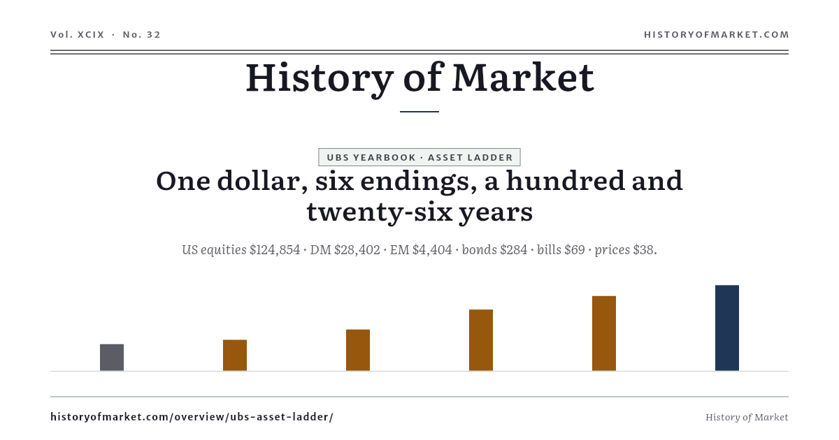
One Dollar, 126 Years — Six Asset Classes preview
Coordinates · 720×420

One Dollar, 126 Years — Six Asset Classes

$1 in 1900 became $124,854 in US equities and $69 in bills; the price level went to $38.

Show iframe code
<iframe
  src="https://historyofmarket.com/embed/ubs-asset-ladder?lang=en&theme=light"
  width="720"
  height="420"
  loading="lazy"
  frameborder="0"
  scrolling="no"
  referrerpolicy="no-referrer-when-downgrade"
  title="History of Market — ubs-asset-ladder chart embed"
  style="border:0;max-width:100%;width:100%;display:block;">
</iframe>
<p style="margin:4px 0 0;font-size:12px;color:#666;">
  Source: <a href="https://historyofmarket.com/overview/ubs-asset-ladder/">One Dollar, 126 Years — Six Asset Classes — History of Market</a>
</p>
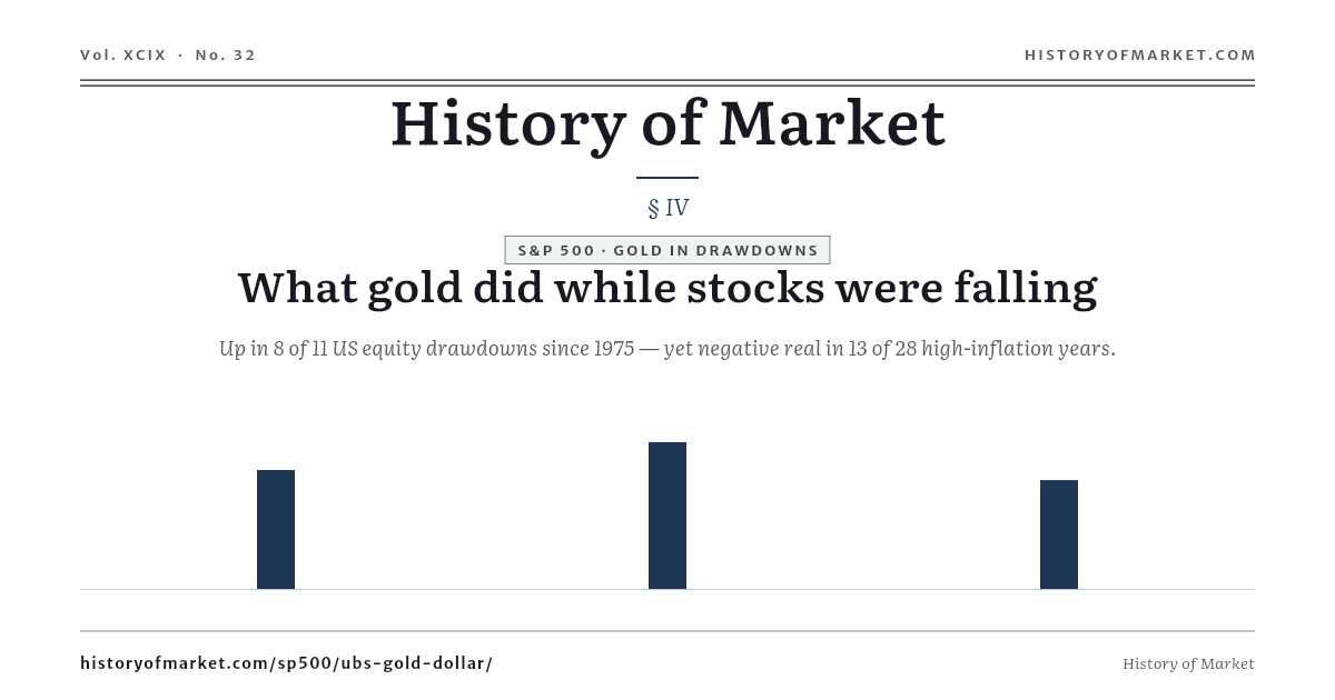
Gold Through Eleven Equity Drawdowns preview
Coordinates · 720×420

Gold Through Eleven Equity Drawdowns

Gold rose in 8 of the 11 major US drawdowns since 1975 — and lost real value in 13 of the 28 high-inflation years.

Show iframe code
<iframe
  src="https://historyofmarket.com/embed/ubs-gold-dollar?lang=en&theme=light"
  width="720"
  height="420"
  loading="lazy"
  frameborder="0"
  scrolling="no"
  referrerpolicy="no-referrer-when-downgrade"
  title="History of Market — ubs-gold-dollar chart embed"
  style="border:0;max-width:100%;width:100%;display:block;">
</iframe>
<p style="margin:4px 0 0;font-size:12px;color:#666;">
  Source: <a href="https://historyofmarket.com/sp500/ubs-gold-dollar/">Gold Through Eleven Equity Drawdowns — History of Market</a>
</p>

S&P 500

Returns, drawdowns, valuation and anatomy of the broad U.S. equity market.

S&P 500 — Annual Returns Since 1928 preview
Returns · 720×420

S&P 500 — Annual Returns Since 1928

66 up, 30 down, 2 flat on price return — the full annual ledger on a bar chart.

Show iframe code
<iframe
  src="https://historyofmarket.com/embed/annual?lang=en&theme=light"
  width="720"
  height="420"
  loading="lazy"
  frameborder="0"
  scrolling="no"
  referrerpolicy="no-referrer-when-downgrade"
  title="History of Market — annual chart embed"
  style="border:0;max-width:100%;width:100%;display:block;">
</iframe>
<p style="margin:4px 0 0;font-size:12px;color:#666;">
  Source: <a href="https://historyofmarket.com/sp500/annual/">S&amp;P 500 — Annual Returns Since 1928 — History of Market</a>
</p>
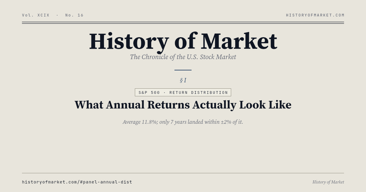
S&P 500 — Annual Return Distribution preview
Returns · 720×420

S&P 500 — Annual Return Distribution

Average 11.9% — but only 7 of the 98 finished years actually landed near it.

Show iframe code
<iframe
  src="https://historyofmarket.com/embed/annual-dist?lang=en&theme=light"
  width="720"
  height="420"
  loading="lazy"
  frameborder="0"
  scrolling="no"
  referrerpolicy="no-referrer-when-downgrade"
  title="History of Market — annual-dist chart embed"
  style="border:0;max-width:100%;width:100%;display:block;">
</iframe>
<p style="margin:4px 0 0;font-size:12px;color:#666;">
  Source: <a href="https://historyofmarket.com/sp500/annual-dist/">S&amp;P 500 — Annual Return Distribution — History of Market</a>
</p>
S&P 500 — Buy-Year × Sell-Year Annualized preview
Returns · 520×520

S&P 500 — Buy-Year × Sell-Year Annualized

Hold-period heatmap: every entry-year × exit-year combination.

Show iframe code
<iframe
  src="https://historyofmarket.com/embed/annualized-matrix?lang=en&theme=light"
  width="520"
  height="520"
  loading="lazy"
  frameborder="0"
  scrolling="no"
  referrerpolicy="no-referrer-when-downgrade"
  title="History of Market — annualized-matrix chart embed"
  style="border:0;max-width:100%;width:100%;display:block;">
</iframe>
<p style="margin:4px 0 0;font-size:12px;color:#666;">
  Source: <a href="https://historyofmarket.com/sp500/annualized-matrix/">S&amp;P 500 — Buy-Year × Sell-Year Annualized — History of Market</a>
</p>
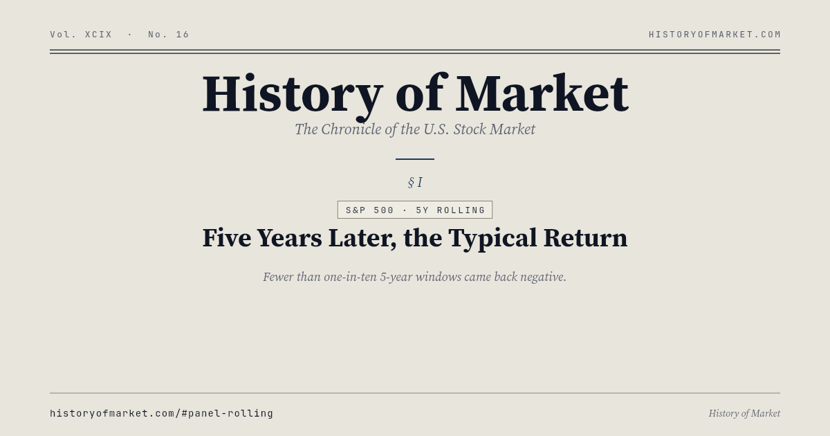
S&P 500 — Five-Year Rolling Annualized preview
Returns · 720×420

S&P 500 — Five-Year Rolling Annualized

Fewer than 1-in-10 rolling 5-year windows finished negative.

Show iframe code
<iframe
  src="https://historyofmarket.com/embed/rolling?lang=en&theme=light"
  width="720"
  height="420"
  loading="lazy"
  frameborder="0"
  scrolling="no"
  referrerpolicy="no-referrer-when-downgrade"
  title="History of Market — rolling chart embed"
  style="border:0;max-width:100%;width:100%;display:block;">
</iframe>
<p style="margin:4px 0 0;font-size:12px;color:#666;">
  Source: <a href="https://historyofmarket.com/sp500/rolling/">S&amp;P 500 — Five-Year Rolling Annualized — History of Market</a>
</p>
S&P 500 — Total Return = Price + Dividend + Buyback preview
Returns · 720×420

S&P 500 — Total Return = Price + Dividend + Buyback

Buybacks now rival dividends as the second pillar of total return.

Show iframe code
<iframe
  src="https://historyofmarket.com/embed/return-details?lang=en&theme=light"
  width="720"
  height="420"
  loading="lazy"
  frameborder="0"
  scrolling="no"
  referrerpolicy="no-referrer-when-downgrade"
  title="History of Market — return-details chart embed"
  style="border:0;max-width:100%;width:100%;display:block;">
</iframe>
<p style="margin:4px 0 0;font-size:12px;color:#666;">
  Source: <a href="https://historyofmarket.com/sp500/return-details/">S&amp;P 500 — Total Return = Price + Dividend + Buyback — History of Market</a>
</p>
S&P 500 — Daily Returns vs the Normal Curve preview
Returns · 720×420

S&P 500 — Daily Returns vs the Normal Curve

6,600+ daily returns since 2000 against the normal curve — the fat tails hold the story.

Show iframe code
<iframe
  src="https://historyofmarket.com/embed/sp500-daily-distribution?lang=en&theme=light"
  width="720"
  height="420"
  loading="lazy"
  frameborder="0"
  scrolling="no"
  referrerpolicy="no-referrer-when-downgrade"
  title="History of Market — sp500-daily-distribution chart embed"
  style="border:0;max-width:100%;width:100%;display:block;">
</iframe>
<p style="margin:4px 0 0;font-size:12px;color:#666;">
  Source: <a href="https://historyofmarket.com/sp500/sp500-daily-distribution/">S&amp;P 500 — Daily Returns vs the Normal Curve — History of Market</a>
</p>
S&P 500 — What the Best and Worst Days Multiply preview
Returns · 720×420

S&P 500 — What the Best and Worst Days Multiply

Best 50 days ×13.4, worst 30 days ×0.15 — a multiplicative ledger since 2000.

Show iframe code
<iframe
  src="https://historyofmarket.com/embed/sp500-daily-extremes?lang=en&theme=light"
  width="720"
  height="420"
  loading="lazy"
  frameborder="0"
  scrolling="no"
  referrerpolicy="no-referrer-when-downgrade"
  title="History of Market — sp500-daily-extremes chart embed"
  style="border:0;max-width:100%;width:100%;display:block;">
</iframe>
<p style="margin:4px 0 0;font-size:12px;color:#666;">
  Source: <a href="https://historyofmarket.com/sp500/sp500-daily-extremes/">S&amp;P 500 — What the Best and Worst Days Multiply — History of Market</a>
</p>
S&P 500 — Log YoY (Bull/Bear Boundary) preview
Returns · 720×420

S&P 500 — Log YoY (Bull/Bear Boundary)

Fourteen zero-line crossings since 1928 — the macro pulse.

Show iframe code
<iframe
  src="https://historyofmarket.com/embed/sp500-logyoy?lang=en&theme=light"
  width="720"
  height="420"
  loading="lazy"
  frameborder="0"
  scrolling="no"
  referrerpolicy="no-referrer-when-downgrade"
  title="History of Market — sp500-logyoy chart embed"
  style="border:0;max-width:100%;width:100%;display:block;">
</iframe>
<p style="margin:4px 0 0;font-size:12px;color:#666;">
  Source: <a href="https://historyofmarket.com/sp500/sp500-logyoy/">S&amp;P 500 — Log YoY (Bull/Bear Boundary) — History of Market</a>
</p>
S&P 500 — Every Major Drawdown Since 1929 preview
Crisis · 720×420

S&P 500 — Every Major Drawdown Since 1929

Every named decline with depth, duration, and recovery in days.

Show iframe code
<iframe
  src="https://historyofmarket.com/embed/drawdown?lang=en&theme=light"
  width="720"
  height="420"
  loading="lazy"
  frameborder="0"
  scrolling="no"
  referrerpolicy="no-referrer-when-downgrade"
  title="History of Market — drawdown chart embed"
  style="border:0;max-width:100%;width:100%;display:block;">
</iframe>
<p style="margin:4px 0 0;font-size:12px;color:#666;">
  Source: <a href="https://historyofmarket.com/sp500/drawdown/">S&amp;P 500 — Every Major Drawdown Since 1929 — History of Market</a>
</p>
S&P 500 — Intrayear Drop vs Year-End Outcome preview
Crisis · 720×420

S&P 500 — Intrayear Drop vs Year-End Outcome

Average intrayear pullback −14%; year-end average still positive.

Show iframe code
<iframe
  src="https://historyofmarket.com/embed/intrayear-dd?lang=en&theme=light"
  width="720"
  height="420"
  loading="lazy"
  frameborder="0"
  scrolling="no"
  referrerpolicy="no-referrer-when-downgrade"
  title="History of Market — intrayear-dd chart embed"
  style="border:0;max-width:100%;width:100%;display:block;">
</iframe>
<p style="margin:4px 0 0;font-size:12px;color:#666;">
  Source: <a href="https://historyofmarket.com/sp500/intrayear-dd/">S&amp;P 500 — Intrayear Drop vs Year-End Outcome — History of Market</a>
</p>
S&P 500 — Realized Volatility (20d / 60d) preview
Crisis · 720×420

S&P 500 — Realized Volatility (20d / 60d)

Long-term median ~15%; >30% marks transitional regimes.

Show iframe code
<iframe
  src="https://historyofmarket.com/embed/volatility?lang=en&theme=light"
  width="720"
  height="420"
  loading="lazy"
  frameborder="0"
  scrolling="no"
  referrerpolicy="no-referrer-when-downgrade"
  title="History of Market — volatility chart embed"
  style="border:0;max-width:100%;width:100%;display:block;">
</iframe>
<p style="margin:4px 0 0;font-size:12px;color:#666;">
  Source: <a href="https://historyofmarket.com/sp500/volatility/">S&amp;P 500 — Realized Volatility (20d / 60d) — History of Market</a>
</p>
S&P 500 — Breadth Above the Moving Averages preview
Crisis · 720×420

S&P 500 — Breadth Above the Moving Averages

The share of 500 members above their 50/200-day averages: full march or narrow rally.

Show iframe code
<iframe
  src="https://historyofmarket.com/embed/sp500-breadth?lang=en&theme=light"
  width="720"
  height="420"
  loading="lazy"
  frameborder="0"
  scrolling="no"
  referrerpolicy="no-referrer-when-downgrade"
  title="History of Market — sp500-breadth chart embed"
  style="border:0;max-width:100%;width:100%;display:block;">
</iframe>
<p style="margin:4px 0 0;font-size:12px;color:#666;">
  Source: <a href="https://historyofmarket.com/sp500/sp500-breadth/">S&amp;P 500 — Breadth Above the Moving Averages — History of Market</a>
</p>
VIX vs S&P 500 — The Bill for Hedging preview
Crisis · 720×420

VIX vs S&P 500 — The Bill for Hedging

Above 30, the market is already paying to hedge the next risk.

Show iframe code
<iframe
  src="https://historyofmarket.com/embed/vix?lang=en&theme=light"
  width="720"
  height="420"
  loading="lazy"
  frameborder="0"
  scrolling="no"
  referrerpolicy="no-referrer-when-downgrade"
  title="History of Market — vix chart embed"
  style="border:0;max-width:100%;width:100%;display:block;">
</iframe>
<p style="margin:4px 0 0;font-size:12px;color:#666;">
  Source: <a href="https://historyofmarket.com/sp500/vix/">VIX vs S&amp;P 500 — The Bill for Hedging — History of Market</a>
</p>
S&P 500 — Monthly Heatmap & Win Rates preview
Crisis · 720×420

S&P 500 — Monthly Heatmap & Win Rates

Twelve months, twelve temperaments — November friendliest, September cruelest.

Show iframe code
<iframe
  src="https://historyofmarket.com/embed/monthly?lang=en&theme=light"
  width="720"
  height="420"
  loading="lazy"
  frameborder="0"
  scrolling="no"
  referrerpolicy="no-referrer-when-downgrade"
  title="History of Market — monthly chart embed"
  style="border:0;max-width:100%;width:100%;display:block;">
</iframe>
<p style="margin:4px 0 0;font-size:12px;color:#666;">
  Source: <a href="https://historyofmarket.com/sp500/monthly/">S&amp;P 500 — Monthly Heatmap &amp; Win Rates — History of Market</a>
</p>
Shiller CAPE — Cycle-Smoothed P/E preview
Valuation · 720×420

Shiller CAPE — Cycle-Smoothed P/E

Historical mean ~17×; today's reading sits near a century high.

Show iframe code
<iframe
  src="https://historyofmarket.com/embed/pe?lang=en&theme=light"
  width="720"
  height="420"
  loading="lazy"
  frameborder="0"
  scrolling="no"
  referrerpolicy="no-referrer-when-downgrade"
  title="History of Market — pe chart embed"
  style="border:0;max-width:100%;width:100%;display:block;">
</iframe>
<p style="margin:4px 0 0;font-size:12px;color:#666;">
  Source: <a href="https://historyofmarket.com/sp500/pe/">Shiller CAPE — Cycle-Smoothed P/E — History of Market</a>
</p>
AIAE — America's Equity Allocation preview
Valuation · 720×420

AIAE — America's Equity Allocation

A sharper 10-year return predictor than Shiller CAPE.

Show iframe code
<iframe
  src="https://historyofmarket.com/embed/aiae?lang=en&theme=light"
  width="720"
  height="420"
  loading="lazy"
  frameborder="0"
  scrolling="no"
  referrerpolicy="no-referrer-when-downgrade"
  title="History of Market — aiae chart embed"
  style="border:0;max-width:100%;width:100%;display:block;">
</iframe>
<p style="margin:4px 0 0;font-size:12px;color:#666;">
  Source: <a href="https://historyofmarket.com/sp500/aiae/">AIAE — America&#39;s Equity Allocation — History of Market</a>
</p>
S&P 500 — Earnings Per Share (TTM) preview
Valuation · 720×420

S&P 500 — Earnings Per Share (TTM)

The numerator behind every multiple.

Show iframe code
<iframe
  src="https://historyofmarket.com/embed/eps?lang=en&theme=light"
  width="720"
  height="420"
  loading="lazy"
  frameborder="0"
  scrolling="no"
  referrerpolicy="no-referrer-when-downgrade"
  title="History of Market — eps chart embed"
  style="border:0;max-width:100%;width:100%;display:block;">
</iframe>
<p style="margin:4px 0 0;font-size:12px;color:#666;">
  Source: <a href="https://historyofmarket.com/sp500/eps/">S&amp;P 500 — Earnings Per Share (TTM) — History of Market</a>
</p>
S&P 500 — Return on Equity preview
Valuation · 720×420

S&P 500 — Return on Equity

Remarkably steady near 15% across two decades.

Show iframe code
<iframe
  src="https://historyofmarket.com/embed/roe?lang=en&theme=light"
  width="720"
  height="420"
  loading="lazy"
  frameborder="0"
  scrolling="no"
  referrerpolicy="no-referrer-when-downgrade"
  title="History of Market — roe chart embed"
  style="border:0;max-width:100%;width:100%;display:block;">
</iframe>
<p style="margin:4px 0 0;font-size:12px;color:#666;">
  Source: <a href="https://historyofmarket.com/sp500/roe/">S&amp;P 500 — Return on Equity — History of Market</a>
</p>
S&P 500 — Trailing vs. Forward PE preview
Valuation · 720×420

S&P 500 — Trailing vs. Forward PE

Daily cap-weighted trailing PE, a weekly terminal forward PE back to 1990, and a separately computed daily forward line — three series, one axis, never merged.

Show iframe code
<iframe
  src="https://historyofmarket.com/embed/forward-pe?lang=en&theme=light"
  width="720"
  height="420"
  loading="lazy"
  frameborder="0"
  scrolling="no"
  referrerpolicy="no-referrer-when-downgrade"
  title="History of Market — forward-pe chart embed"
  style="border:0;max-width:100%;width:100%;display:block;">
</iframe>
<p style="margin:4px 0 0;font-size:12px;color:#666;">
  Source: <a href="https://historyofmarket.com/sp500/forward-pe/">S&amp;P 500 — Trailing vs. Forward PE — History of Market</a>
</p>
S&P 500 — A Multiple Year or an Earnings Year? preview
Valuation · 720×420

S&P 500 — A Multiple Year or an Earnings Year?

98 years since 1928 split into PE change × EPS change: the multiple alone drove 17, earnings alone 13, and in 63 the two pulled against each other.

Show iframe code
<iframe
  src="https://historyofmarket.com/embed/sp500-driver-decomp?lang=en&theme=light"
  width="720"
  height="420"
  loading="lazy"
  frameborder="0"
  scrolling="no"
  referrerpolicy="no-referrer-when-downgrade"
  title="History of Market — sp500-driver-decomp chart embed"
  style="border:0;max-width:100%;width:100%;display:block;">
</iframe>
<p style="margin:4px 0 0;font-size:12px;color:#666;">
  Source: <a href="https://historyofmarket.com/sp500/sp500-driver-decomp/">S&amp;P 500 — A Multiple Year or an Earnings Year? — History of Market</a>
</p>
S&P 500 — GICS 11-Sector Weights preview
Anatomy · 520×520

S&P 500 — GICS 11-Sector Weights

Tech dominant; the rest of the economy trailing.

Show iframe code
<iframe
  src="https://historyofmarket.com/embed/sectors?lang=en&theme=light"
  width="520"
  height="520"
  loading="lazy"
  frameborder="0"
  scrolling="no"
  referrerpolicy="no-referrer-when-downgrade"
  title="History of Market — sectors chart embed"
  style="border:0;max-width:100%;width:100%;display:block;">
</iframe>
<p style="margin:4px 0 0;font-size:12px;color:#666;">
  Source: <a href="https://historyofmarket.com/sp500/sectors/">S&amp;P 500 — GICS 11-Sector Weights — History of Market</a>
</p>
S&P 500 — Every Member by Size, Return and Weight preview
Anatomy · 720×420

S&P 500 — Every Member by Size, Return and Weight

All 503 members at once: market cap against one-year return, dot area scaled to index weight — the ten largest carry more than a third of it.

Show iframe code
<iframe
  src="https://historyofmarket.com/embed/scatter?lang=en&theme=light"
  width="720"
  height="420"
  loading="lazy"
  frameborder="0"
  scrolling="no"
  referrerpolicy="no-referrer-when-downgrade"
  title="History of Market — scatter chart embed"
  style="border:0;max-width:100%;width:100%;display:block;">
</iframe>
<p style="margin:4px 0 0;font-size:12px;color:#666;">
  Source: <a href="https://historyofmarket.com/sp500/scatter/">S&amp;P 500 — Every Member by Size, Return and Weight — History of Market</a>
</p>
Magnificent 7

The seven names rewriting the index: an equal-weight reference series, their share of the market, how far each one has fallen, and what they cost measured against the 1999 cohort.

Magnificent 7 — Equal-Weight Index preview
Anatomy · 720×420

Magnificent 7 — Equal-Weight Index

AAPL, MSFT, NVDA, GOOGL, AMZN, META, TSLA — indexed to 2022-01-03.

Show iframe code
<iframe
  src="https://historyofmarket.com/embed/m7?lang=en&theme=light"
  width="720"
  height="420"
  loading="lazy"
  frameborder="0"
  scrolling="no"
  referrerpolicy="no-referrer-when-downgrade"
  title="History of Market — m7 chart embed"
  style="border:0;max-width:100%;width:100%;display:block;">
</iframe>
<p style="margin:4px 0 0;font-size:12px;color:#666;">
  Source: <a href="https://historyofmarket.com/sp500/m7/">Magnificent 7 — Equal-Weight Index — History of Market</a>
</p>
Seven Companies, a Third of the S&P 500 preview
Anatomy · 720×420

Seven Companies, a Third of the S&P 500

The M7 share of S&P 500 market cap went from 13.0% at the end of 2018 to a 33.5% peak at the end of 2025.

Show iframe code
<iframe
  src="https://historyofmarket.com/embed/mag7-concentration?lang=en&theme=light"
  width="720"
  height="420"
  loading="lazy"
  frameborder="0"
  scrolling="no"
  referrerpolicy="no-referrer-when-downgrade"
  title="History of Market — mag7-concentration chart embed"
  style="border:0;max-width:100%;width:100%;display:block;">
</iframe>
<p style="margin:4px 0 0;font-size:12px;color:#666;">
  Source: <a href="https://historyofmarket.com/mag7/mag7-concentration/">Seven Companies, a Third of the S&amp;P 500 — History of Market</a>
</p>
Magnificent 7 — Every Member's Drawdown Since 2018 preview
Crisis · 720×420

Magnificent 7 — Every Member's Drawdown Since 2018

Daily peak-to-date drawdown, one panel per member: Meta's −76.7% in 2022 was the deepest, Microsoft's −37.1% the shallowest.

Show iframe code
<iframe
  src="https://historyofmarket.com/embed/mag7-drawdown?lang=en&theme=light"
  width="720"
  height="420"
  loading="lazy"
  frameborder="0"
  scrolling="no"
  referrerpolicy="no-referrer-when-downgrade"
  title="History of Market — mag7-drawdown chart embed"
  style="border:0;max-width:100%;width:100%;display:block;">
</iframe>
<p style="margin:4px 0 0;font-size:12px;color:#666;">
  Source: <a href="https://historyofmarket.com/mag7/mag7-drawdown/">Magnificent 7 — Every Member&#39;s Drawdown Since 2018 — History of Market</a>
</p>
Today's AI Leaders Against the 1999 Cohort preview
Valuation · 720×420

Today's AI Leaders Against the 1999 Cohort

NVDA, MSFT, META and GOOGL trailing PE since 2023, under reference bands at the forward-PE peaks the 1999 names actually printed — Cisco 140×, Oracle 150×.

Show iframe code
<iframe
  src="https://historyofmarket.com/embed/mag7-ai-valuation?lang=en&theme=light"
  width="720"
  height="420"
  loading="lazy"
  frameborder="0"
  scrolling="no"
  referrerpolicy="no-referrer-when-downgrade"
  title="History of Market — mag7-ai-valuation chart embed"
  style="border:0;max-width:100%;width:100%;display:block;">
</iframe>
<p style="margin:4px 0 0;font-size:12px;color:#666;">
  Source: <a href="https://historyofmarket.com/mag7/mag7-ai-valuation/">Today&#39;s AI Leaders Against the 1999 Cohort — History of Market</a>
</p>
Nasdaq Composite

Half a century of the broader Nasdaq market, including the canonical bubble footprint.

Nasdaq Composite — From 100 to 16,000+ preview
The Long Lens · 720×420

Nasdaq Composite — From 100 to 16,000+

Half a century of innovation in one curve, since Feb 5, 1971.

Show iframe code
<iframe
  src="https://historyofmarket.com/embed/nasdaq-composite?lang=en&theme=light"
  width="720"
  height="420"
  loading="lazy"
  frameborder="0"
  scrolling="no"
  referrerpolicy="no-referrer-when-downgrade"
  title="History of Market — nasdaq-composite chart embed"
  style="border:0;max-width:100%;width:100%;display:block;">
</iframe>
<p style="margin:4px 0 0;font-size:12px;color:#666;">
  Source: <a href="https://historyofmarket.com/nasdaq/nasdaq-composite/">Nasdaq Composite — From 100 to 16,000+ — History of Market</a>
</p>
Nasdaq — Log YoY: Footprints of a Bubble preview
The Long Lens · 720×420

Nasdaq — Log YoY: Footprints of a Bubble

Dot-com 2000 and tightening 2022 are the two deepest red stretches.

Show iframe code
<iframe
  src="https://historyofmarket.com/embed/nasdaq-logyoy?lang=en&theme=light"
  width="720"
  height="420"
  loading="lazy"
  frameborder="0"
  scrolling="no"
  referrerpolicy="no-referrer-when-downgrade"
  title="History of Market — nasdaq-logyoy chart embed"
  style="border:0;max-width:100%;width:100%;display:block;">
</iframe>
<p style="margin:4px 0 0;font-size:12px;color:#666;">
  Source: <a href="https://historyofmarket.com/nasdaq/nasdaq-logyoy/">Nasdaq — Log YoY: Footprints of a Bubble — History of Market</a>
</p>
Nasdaq 100 / QQQ

The tech asset class — returns, risk, and the handful of names that already take half the index.

Nasdaq 100 — Annual Returns preview
Returns · 720×420

Nasdaq 100 — Annual Returns

~15% average since 1999; −42% in 2008.

Show iframe code
<iframe
  src="https://historyofmarket.com/embed/nasdaq100-annual?lang=en&theme=light"
  width="720"
  height="420"
  loading="lazy"
  frameborder="0"
  scrolling="no"
  referrerpolicy="no-referrer-when-downgrade"
  title="History of Market — nasdaq100-annual chart embed"
  style="border:0;max-width:100%;width:100%;display:block;">
</iframe>
<p style="margin:4px 0 0;font-size:12px;color:#666;">
  Source: <a href="https://historyofmarket.com/nasdaq/nasdaq100-annual/">Nasdaq 100 — Annual Returns — History of Market</a>
</p>

Nasdaq 100 — Annual Return Distribution preview
Returns · 720×420

Nasdaq 100 — Annual Return Distribution

Thicker tails than the broad market — tech's native shape.

Show iframe code
<iframe
  src="https://historyofmarket.com/embed/ndx-annual-dist?lang=en&theme=light"
  width="720"
  height="420"
  loading="lazy"
  frameborder="0"
  scrolling="no"
  referrerpolicy="no-referrer-when-downgrade"
  title="History of Market — ndx-annual-dist chart embed"
  style="border:0;max-width:100%;width:100%;display:block;">
</iframe>
<p style="margin:4px 0 0;font-size:12px;color:#666;">
  Source: <a href="https://historyofmarket.com/nasdaq/ndx-annual-dist/">Nasdaq 100 — Annual Return Distribution — History of Market</a>
</p>
Nasdaq 100 — Buy × Sell Annualized Matrix preview
Returns · 520×520

Nasdaq 100 — Buy × Sell Annualized Matrix

Annualized-return matrix since 1986.

Show iframe code
<iframe
  src="https://historyofmarket.com/embed/ndx-matrix?lang=en&theme=light"
  width="520"
  height="520"
  loading="lazy"
  frameborder="0"
  scrolling="no"
  referrerpolicy="no-referrer-when-downgrade"
  title="History of Market — ndx-matrix chart embed"
  style="border:0;max-width:100%;width:100%;display:block;">
</iframe>
<p style="margin:4px 0 0;font-size:12px;color:#666;">
  Source: <a href="https://historyofmarket.com/nasdaq/ndx-matrix/">Nasdaq 100 — Buy × Sell Annualized Matrix — History of Market</a>
</p>
Nasdaq 100 — Daily Returns vs the Normal Curve preview
Returns · 720×420

Nasdaq 100 — Daily Returns vs the Normal Curve

Nasdaq 100 daily returns against the normal curve — fatter tails than the S&P 500.

Show iframe code
<iframe
  src="https://historyofmarket.com/embed/ndx-daily-distribution?lang=en&theme=light"
  width="720"
  height="420"
  loading="lazy"
  frameborder="0"
  scrolling="no"
  referrerpolicy="no-referrer-when-downgrade"
  title="History of Market — ndx-daily-distribution chart embed"
  style="border:0;max-width:100%;width:100%;display:block;">
</iframe>
<p style="margin:4px 0 0;font-size:12px;color:#666;">
  Source: <a href="https://historyofmarket.com/nasdaq/ndx-daily-distribution/">Nasdaq 100 — Daily Returns vs the Normal Curve — History of Market</a>
</p>
Nasdaq 100 — What the Best and Worst Days Multiply preview
Returns · 720×420

Nasdaq 100 — What the Best and Worst Days Multiply

The best and worst few dozen days since 2000 decide the Nasdaq 100’s cumulative multiple.

Show iframe code
<iframe
  src="https://historyofmarket.com/embed/ndx-daily-extremes?lang=en&theme=light"
  width="720"
  height="420"
  loading="lazy"
  frameborder="0"
  scrolling="no"
  referrerpolicy="no-referrer-when-downgrade"
  title="History of Market — ndx-daily-extremes chart embed"
  style="border:0;max-width:100%;width:100%;display:block;">
</iframe>
<p style="margin:4px 0 0;font-size:12px;color:#666;">
  Source: <a href="https://historyofmarket.com/nasdaq/ndx-daily-extremes/">Nasdaq 100 — What the Best and Worst Days Multiply — History of Market</a>
</p>
Nasdaq 100 — 5-Year Rolling Annualized preview
Returns · 720×420

Nasdaq 100 — 5-Year Rolling Annualized

Negative windows ≈ one-tenth of history, monthly since 1990.

Show iframe code
<iframe
  src="https://historyofmarket.com/embed/ndx-rolling?lang=en&theme=light"
  width="720"
  height="420"
  loading="lazy"
  frameborder="0"
  scrolling="no"
  referrerpolicy="no-referrer-when-downgrade"
  title="History of Market — ndx-rolling chart embed"
  style="border:0;max-width:100%;width:100%;display:block;">
</iframe>
<p style="margin:4px 0 0;font-size:12px;color:#666;">
  Source: <a href="https://historyofmarket.com/nasdaq/ndx-rolling/">Nasdaq 100 — 5-Year Rolling Annualized — History of Market</a>
</p>
Nasdaq 100 — Forward PE preview
Returns · 720×420

Nasdaq 100 — Forward PE

Terminal 12-month consensus forward PE, weekly back to April 2001 — opening near 85x as post-bubble earnings collapsed toward zero.

Show iframe code
<iframe
  src="https://historyofmarket.com/embed/ndx-forward-pe?lang=en&theme=light"
  width="720"
  height="420"
  loading="lazy"
  frameborder="0"
  scrolling="no"
  referrerpolicy="no-referrer-when-downgrade"
  title="History of Market — ndx-forward-pe chart embed"
  style="border:0;max-width:100%;width:100%;display:block;">
</iframe>
<p style="margin:4px 0 0;font-size:12px;color:#666;">
  Source: <a href="https://historyofmarket.com/nasdaq/ndx-forward-pe/">Nasdaq 100 — Forward PE — History of Market</a>
</p>
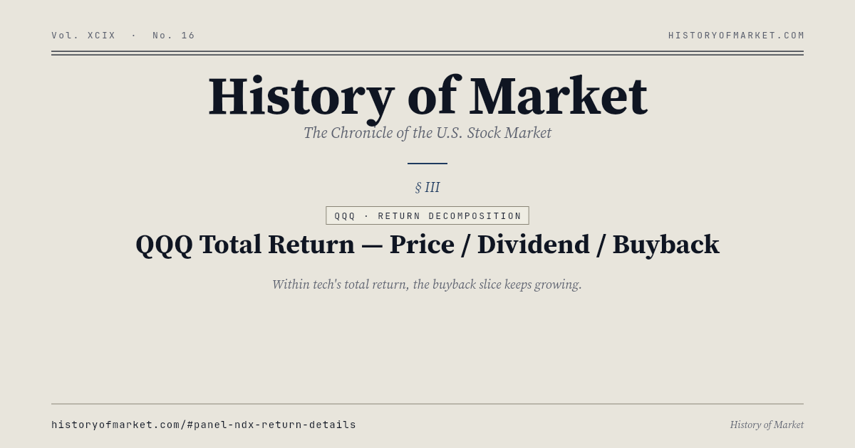
Nasdaq 100 — Total Return = Price + Dividend + Buyback preview
Returns · 720×420

Nasdaq 100 — Total Return = Price + Dividend + Buyback

Averaged over 2000–2026: 12.6% price, 0.8% buybacks, 0.7% dividends — inside tech's total return the buyback slice already outweighs the dividend.

Show iframe code
<iframe
  src="https://historyofmarket.com/embed/ndx-return-details?lang=en&theme=light"
  width="720"
  height="420"
  loading="lazy"
  frameborder="0"
  scrolling="no"
  referrerpolicy="no-referrer-when-downgrade"
  title="History of Market — ndx-return-details chart embed"
  style="border:0;max-width:100%;width:100%;display:block;">
</iframe>
<p style="margin:4px 0 0;font-size:12px;color:#666;">
  Source: <a href="https://historyofmarket.com/nasdaq/ndx-return-details/">Nasdaq 100 — Total Return = Price + Dividend + Buyback — History of Market</a>
</p>
Nasdaq 100 — Rerating × Revision preview
Returns · 720×420

Nasdaq 100 — Rerating × Revision

Each year since 2002 split into forward-PE change × forward-EPS revision: earnings moved 15.7% a year on average, the multiple only 1.1%.

Show iframe code
<iframe
  src="https://historyofmarket.com/embed/ndx-driver-decomp?lang=en&theme=light"
  width="720"
  height="420"
  loading="lazy"
  frameborder="0"
  scrolling="no"
  referrerpolicy="no-referrer-when-downgrade"
  title="History of Market — ndx-driver-decomp chart embed"
  style="border:0;max-width:100%;width:100%;display:block;">
</iframe>
<p style="margin:4px 0 0;font-size:12px;color:#666;">
  Source: <a href="https://historyofmarket.com/nasdaq/ndx-driver-decomp/">Nasdaq 100 — Rerating × Revision — History of Market</a>
</p>
Nasdaq 100 — 59 Historical Drawdowns preview
Crisis · 720×420

Nasdaq 100 — 59 Historical Drawdowns

−83% from 2000 to 2002 — the canonical bubble.

Show iframe code
<iframe
  src="https://historyofmarket.com/embed/ndx-drawdown?lang=en&theme=light"
  width="720"
  height="420"
  loading="lazy"
  frameborder="0"
  scrolling="no"
  referrerpolicy="no-referrer-when-downgrade"
  title="History of Market — ndx-drawdown chart embed"
  style="border:0;max-width:100%;width:100%;display:block;">
</iframe>
<p style="margin:4px 0 0;font-size:12px;color:#666;">
  Source: <a href="https://historyofmarket.com/nasdaq/ndx-drawdown/">Nasdaq 100 — 59 Historical Drawdowns — History of Market</a>
</p>
Nasdaq 100 — Intrayear Drop vs Outcome preview
Crisis · 720×420

Nasdaq 100 — Intrayear Drop vs Outcome

Intrayear average −18%; year-end average still +18%.

Show iframe code
<iframe
  src="https://historyofmarket.com/embed/ndx-intrayear-dd?lang=en&theme=light"
  width="720"
  height="420"
  loading="lazy"
  frameborder="0"
  scrolling="no"
  referrerpolicy="no-referrer-when-downgrade"
  title="History of Market — ndx-intrayear-dd chart embed"
  style="border:0;max-width:100%;width:100%;display:block;">
</iframe>
<p style="margin:4px 0 0;font-size:12px;color:#666;">
  Source: <a href="https://historyofmarket.com/nasdaq/ndx-intrayear-dd/">Nasdaq 100 — Intrayear Drop vs Outcome — History of Market</a>
</p>
Nasdaq 100 — 20/60-Day Volatility preview
Crisis · 720×420

Nasdaq 100 — 20/60-Day Volatility

Median ~22%, structurally above the S&P 500.

Show iframe code
<iframe
  src="https://historyofmarket.com/embed/ndx-volatility?lang=en&theme=light"
  width="720"
  height="420"
  loading="lazy"
  frameborder="0"
  scrolling="no"
  referrerpolicy="no-referrer-when-downgrade"
  title="History of Market — ndx-volatility chart embed"
  style="border:0;max-width:100%;width:100%;display:block;">
</iframe>
<p style="margin:4px 0 0;font-size:12px;color:#666;">
  Source: <a href="https://historyofmarket.com/nasdaq/ndx-volatility/">Nasdaq 100 — 20/60-Day Volatility — History of Market</a>
</p>
Nasdaq 100 — Monthly Heatmap preview
Crisis · 720×420

Nasdaq 100 — Monthly Heatmap

Since 1985 — November and December friendliest, January cruelest.

Show iframe code
<iframe
  src="https://historyofmarket.com/embed/ndx-monthly?lang=en&theme=light"
  width="720"
  height="420"
  loading="lazy"
  frameborder="0"
  scrolling="no"
  referrerpolicy="no-referrer-when-downgrade"
  title="History of Market — ndx-monthly chart embed"
  style="border:0;max-width:100%;width:100%;display:block;">
</iframe>
<p style="margin:4px 0 0;font-size:12px;color:#666;">
  Source: <a href="https://historyofmarket.com/nasdaq/ndx-monthly/">Nasdaq 100 — Monthly Heatmap — History of Market</a>
</p>
Nasdaq 100 — Breadth Above the Moving Averages preview
Crisis · 720×420

Nasdaq 100 — Breadth Above the Moving Averages

The share of 100 members above their 50/200-day averages — how wide the tech rally runs.

Show iframe code
<iframe
  src="https://historyofmarket.com/embed/ndx-breadth?lang=en&theme=light"
  width="720"
  height="420"
  loading="lazy"
  frameborder="0"
  scrolling="no"
  referrerpolicy="no-referrer-when-downgrade"
  title="History of Market — ndx-breadth chart embed"
  style="border:0;max-width:100%;width:100%;display:block;">
</iframe>
<p style="margin:4px 0 0;font-size:12px;color:#666;">
  Source: <a href="https://historyofmarket.com/nasdaq/ndx-breadth/">Nasdaq 100 — Breadth Above the Moving Averages — History of Market</a>
</p>
VXN — Nasdaq 100 Fear Index preview
Crisis · 720×420

VXN — Nasdaq 100 Fear Index

Above 35, tech has already entered systemic-risk pricing.

Show iframe code
<iframe
  src="https://historyofmarket.com/embed/ndx-vxn?lang=en&theme=light"
  width="720"
  height="420"
  loading="lazy"
  frameborder="0"
  scrolling="no"
  referrerpolicy="no-referrer-when-downgrade"
  title="History of Market — ndx-vxn chart embed"
  style="border:0;max-width:100%;width:100%;display:block;">
</iframe>
<p style="margin:4px 0 0;font-size:12px;color:#666;">
  Source: <a href="https://historyofmarket.com/nasdaq/ndx-vxn/">VXN — Nasdaq 100 Fear Index — History of Market</a>
</p>
Nasdaq 100 — Top 25 Holdings & Cumulative Share preview
Anatomy · 520×520

Nasdaq 100 — Top 25 Holdings & Cumulative Share

Seven names already take half — buying QQQ bets on those seven.

Show iframe code
<iframe
  src="https://historyofmarket.com/embed/nasdaq100-weights?lang=en&theme=light"
  width="520"
  height="520"
  loading="lazy"
  frameborder="0"
  scrolling="no"
  referrerpolicy="no-referrer-when-downgrade"
  title="History of Market — nasdaq100-weights chart embed"
  style="border:0;max-width:100%;width:100%;display:block;">
</iframe>
<p style="margin:4px 0 0;font-size:12px;color:#666;">
  Source: <a href="https://historyofmarket.com/nasdaq/nasdaq100-weights/">Nasdaq 100 — Top 25 Holdings &amp; Cumulative Share — History of Market</a>
</p>
Nasdaq 100 — Every Member by Size, Return and Weight preview
Anatomy · 720×420

Nasdaq 100 — Every Member by Size, Return and Weight

All 100 members at once: market cap on a log axis against one-year return, dot area scaled to QQQ weight — the ten largest already take 46%.

Show iframe code
<iframe
  src="https://historyofmarket.com/embed/ndx-scatter?lang=en&theme=light"
  width="720"
  height="420"
  loading="lazy"
  frameborder="0"
  scrolling="no"
  referrerpolicy="no-referrer-when-downgrade"
  title="History of Market — ndx-scatter chart embed"
  style="border:0;max-width:100%;width:100%;display:block;">
</iframe>
<p style="margin:4px 0 0;font-size:12px;color:#666;">
  Source: <a href="https://historyofmarket.com/nasdaq/ndx-scatter/">Nasdaq 100 — Every Member by Size, Return and Weight — History of Market</a>
</p>
Nasdaq 100 — 1-Week / 1-Month / YTD / 1-Year Return Rankings preview
Anatomy · 720×420

Nasdaq 100 — 1-Week / 1-Month / YTD / 1-Year Return Rankings

All 100 members ranked over four trailing windows — one week, one month, year-to-date, one year — with the toggle live inside the frame.

Show iframe code
<iframe
  src="https://historyofmarket.com/embed/nasdaq100-ytd?lang=en&theme=light"
  width="720"
  height="420"
  loading="lazy"
  frameborder="0"
  scrolling="no"
  referrerpolicy="no-referrer-when-downgrade"
  title="History of Market — nasdaq100-ytd chart embed"
  style="border:0;max-width:100%;width:100%;display:block;">
</iframe>
<p style="margin:4px 0 0;font-size:12px;color:#666;">
  Source: <a href="https://historyofmarket.com/nasdaq/nasdaq100-ytd/">Nasdaq 100 — 1-Week / 1-Month / YTD / 1-Year Return Rankings — History of Market</a>
</p>